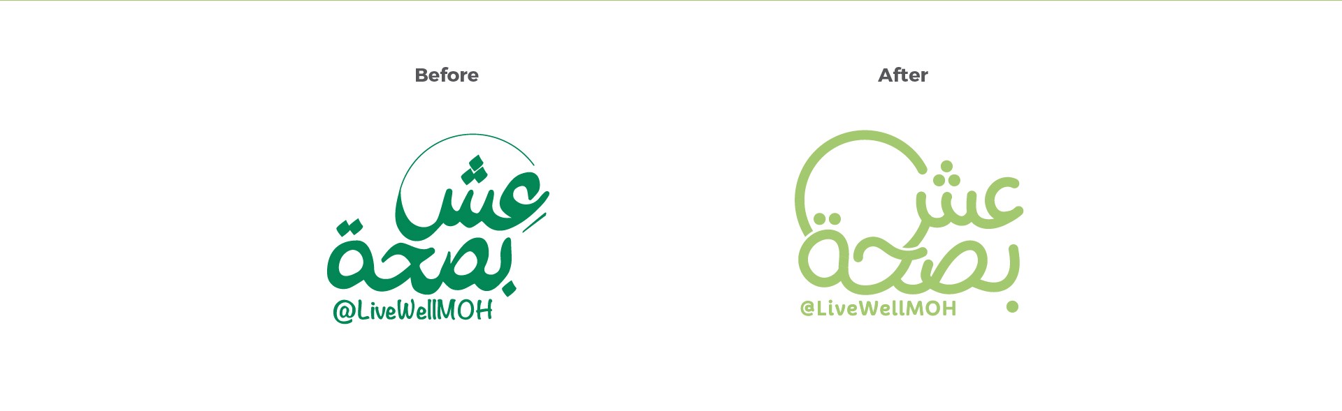
I led the creative and art direction for the initiative, redesigning the existing typography-based logo and developing a complete visual identity system.
The concept was inspired by the Circle of Life, representing how every aspect of life revolves around health and well-being. Circular forms became the foundation of the identity, creating a visual language that communicates continuity, balance, movement, and everyday wellness. While the color palette was inspired by the Ministry of Health's visual identity, it was reinterpreted with softer, more vibrant tones to create a friendlier and more youthful personality. The goal was to make health communication feel approachable, positive, and engaging.


Logo redesign, complete brand identity, visual language, brand patterns, color palette, typography system, and a brand guidelines booklet.
Role: Creative Direction · Art Direction · Brand Identity Design · Brand Guidelines

Next projects.
(2016-26©)

